DOPINAMINE DRESSING – colour trend S/S 22


Sept 21, 2021
colourtrends_summer-22
                   Mood created by MOJECT – Christine Sweers

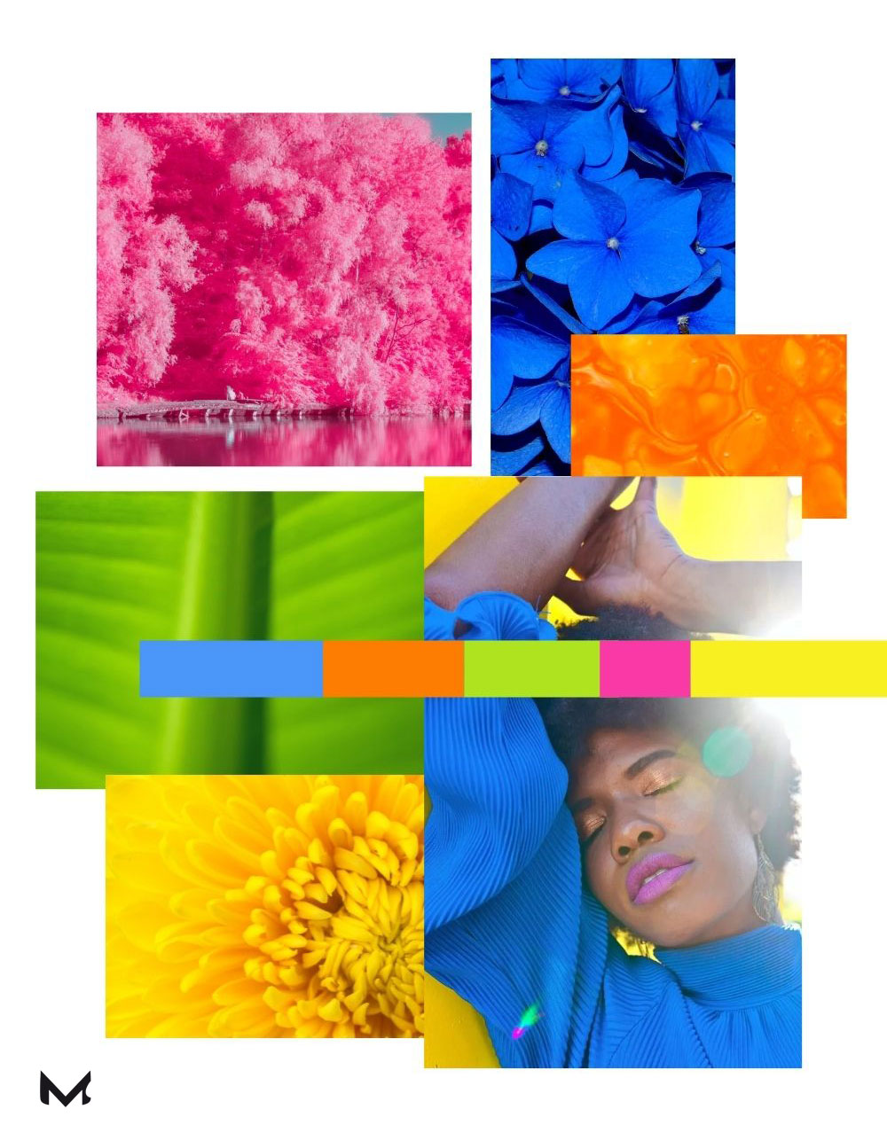
A year ago we designers were still wondering how post-pandemic fashion would look like. With the return of freedom step by step, I feel very attracted by bright and optimistic colours. This is reflected in my latest moodboard Sunset Love.

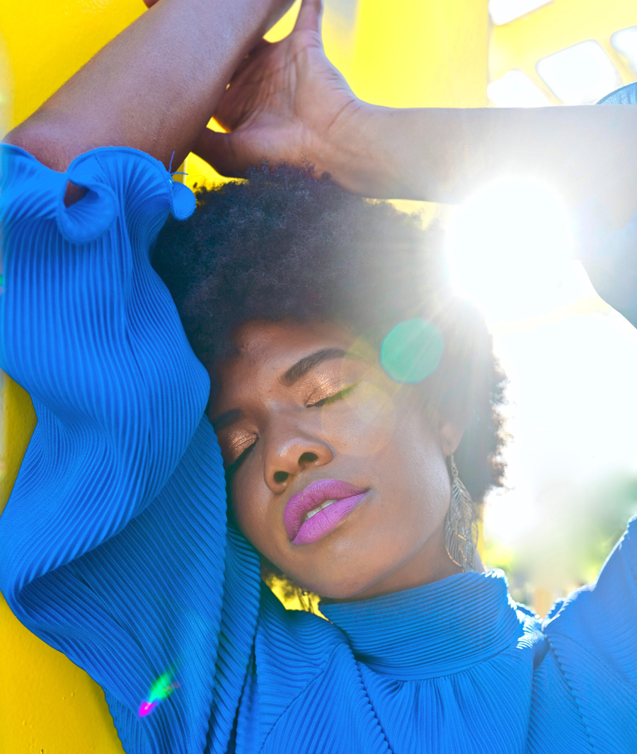
The current fashionshows for S/S 2022 in Berlin, Copenhagen or New York confirm this big desire for colour what we have now: with DOPINAMINE DRESSING  you can boost your mood with colours.

It is a known fact how closely colour is associated to our emotions, and that wearing a specific color has a huge influence on our mood. Dopinamine Dressing is one of the biggest trends after the pandemic.

The international catwalks are dominated by bold, bright and positive colors which reflects the return to the delicate freedom, the cheerfulness about celebrating life with loved ones, having the opportunity to dress for a special occasion.

This is what VOGUE writes in a recent article about DOPINAMINE DRESSING at Copenhagen Fashion Week:

„In fact, “dopamine dressing” has become one of the biggest trends to emerge from the pandemic – a term used to describe the mood-boosting effect that fashion can have. Zingy orange, apple green and hot pink have been among the most popular shades in the Danish capital so far this season. Eye-catching prints, too – as seen on the catwalk at Stine Goya, Soulland and Baum und Pferdgarten – have brought a renewed sense of optimism as we return to IRL shows, with many taking a more-is-more approach to styling.“


Activewear trends S/S 23

Save trend research time to create forward-thinking design.

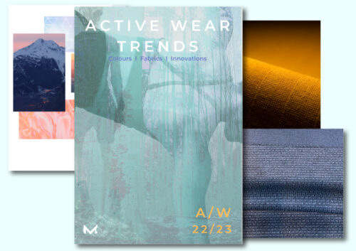
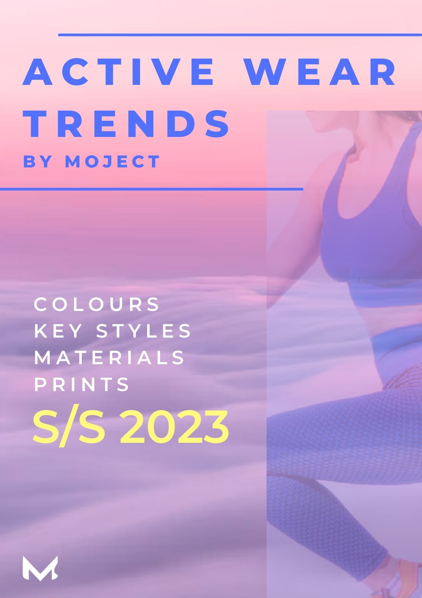
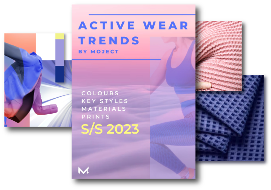
In my new ACTIVE TREND MAGAZINE S/S 2023 I show you which colours are hot for sports S/S 2023, which key styles you should not ignore and what you need to know about innovative fabrics for that season.

Get this beautiful digital magazine full of incredible colour inspirations, specific print ideas, selected functional fabrics and more.

Learn more 


In  „DOPINAMINE BRIGHTS HIT NEW HIGHS“  WGSN describes this trend as follows:

„As the world begins to recover from the impact of the pandemic, consumers are connecting with unapologetically upbeat colors that bring a sense of much needed optimism and joy. With global lockdowns in place people gravitated towards colors that reassure, soothe and offer comfort during times of crisis. The appetite for neutrals grew expediently during the pandemic as consumers wanted to feel protected and grounded.“


                         Image: Aditya Ali

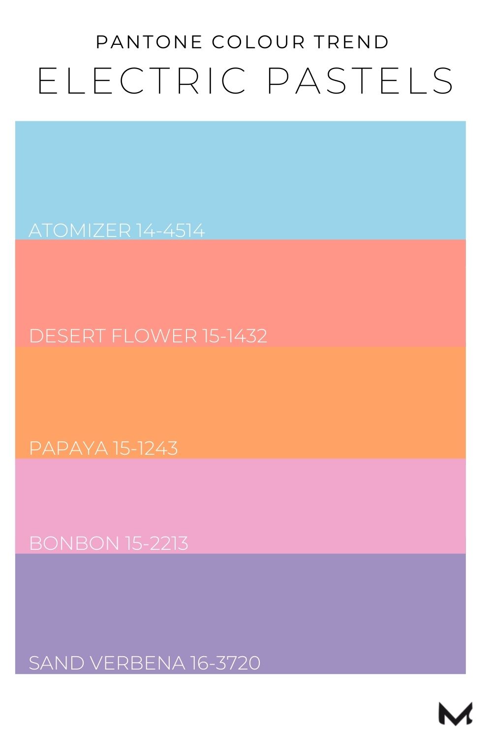
PANTONE sees the new ELECTRIC PASTELS as an expression of the need for joyfulness.

They are more bold and saturated than the pastels of previous years and express a certain power. See here my personal choice of the Pantone colour palette:


fashion colors S/S 22

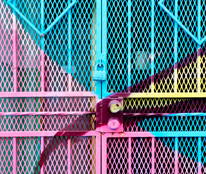
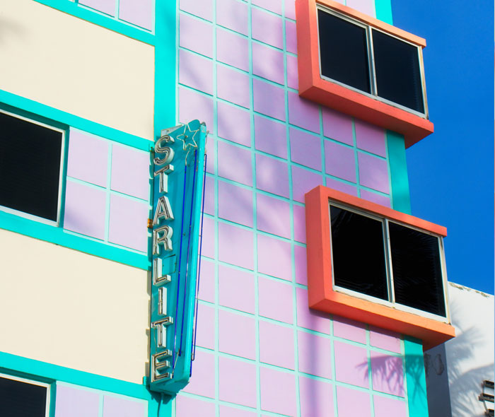
In this digital era, this colour palette also represent our desire for luminosity of colors, as well as a certain nostalgia. Some tones are reminiscent of Miami in the 80s or the looks of the 90s.

These are colours such as PANTONE 15-1243 Papaya, PANTONE 14-0443 Kiwi Colada and PANTONE 15-1435 Desert Flower.

Images: Jason Briscoe  |  Ussama Azam

Interested in trends and design directions for S/S 23?

Get here your free preview!

Join my community and save your free demo version of my Active Trend Magazine S/S 2023. As part of my mailing list you receive appr. two times a month inspirational news and trends for active fashion.

This is what I can tell you already:  the desire for color power and digital colours with luminosity will continue, but they will be combined in a differently way.

Are you looking for the new trend colours Summer 2023?

Check out my Active Trend Forecast S/S 23 with four colour palettes including important shades as kiwi green, acid yellow, aqua blues or digital orange focused on various sports categories. So you will receive a colour chart of 28 colours with all essential colour codes as pantone and COLORO besides beautiful print inspirations, colour usage and functional fabric trends.  Learn more


MOJECT   I   Christine Sweers   I   hello@testumgebung.einfach-anders-jetzt.de


CONTACT      IMPRINT      PRIVACY POLICY 

© Christine Sweers 2021, All rights reserved