Color TREND A/W 23/24 by WGSN + COLORO
These colors are supposed to be directional for the next seasons.
In my opinion a quite beautiful palette that reminds me to the movie „DUNE“: as covered with a layer of dust, a bit mysterious and at the same time very modern.
The colours are intended to reflect the needs of health and healing, travel and discovery or calmness and rest.
This is where the colors stand for:
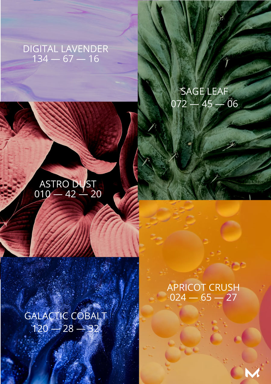
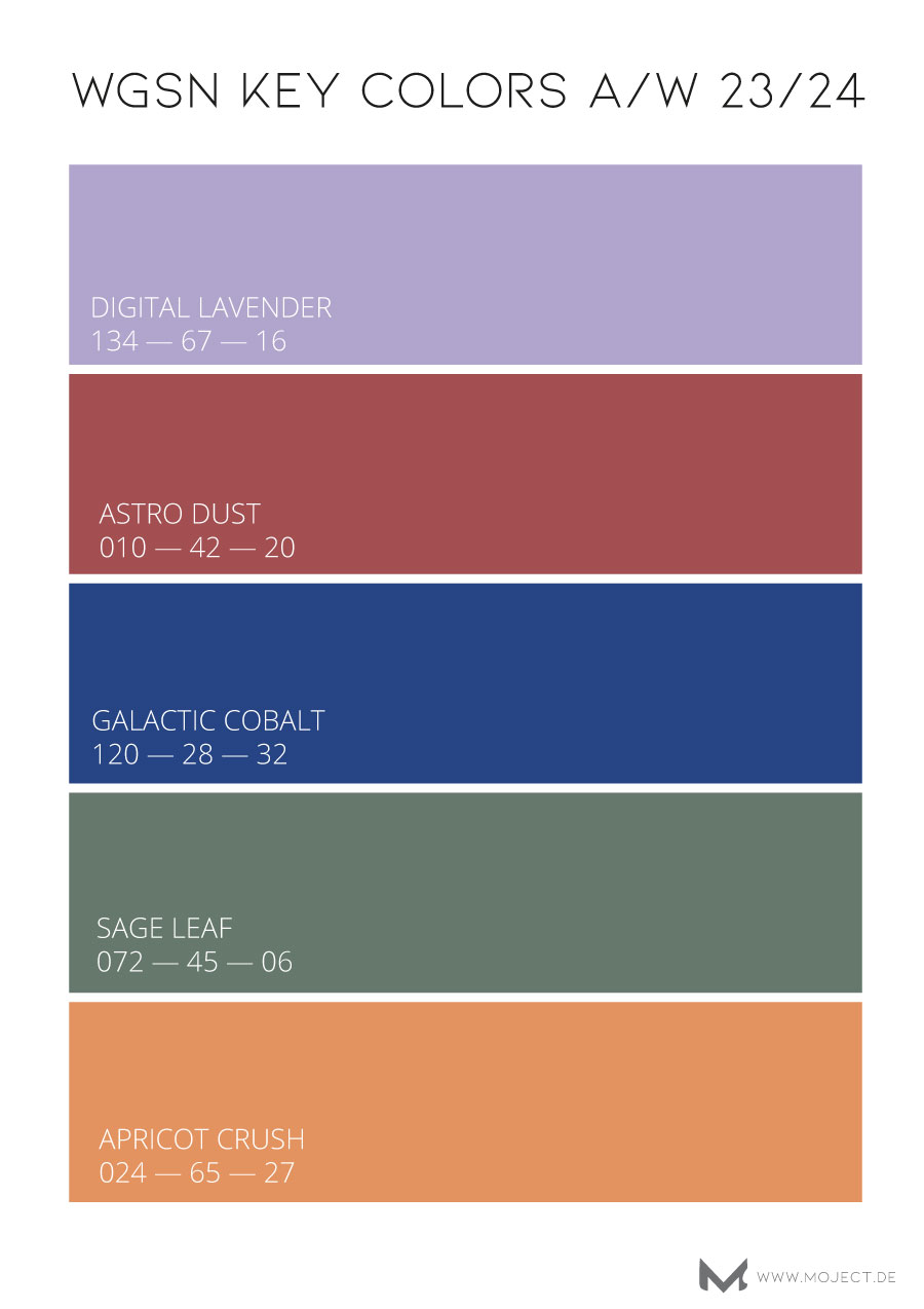
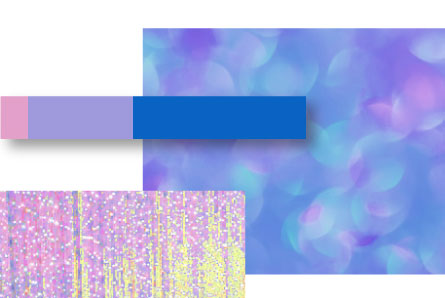
DIGITAL LAVENDER -134 -67 -16, COLOUR OF THE YEAR 2023, is still on board and express „the growing demand for health-boosting digital therapy and calm-tainment.“
ASTRO-DUST – 010-42-20 : related to space exploration it stands for a dusty Mars red, and „captures the desire to explore remote terrains and planets.“
GALACTIC COBALT – 120-28-32: inspired by new spaces and the Metaverse it reflects „Transformative, technologically driven experiences“ which „connect to escapism and extended reality.“
SAGE LEAF – 072-45-06: a colour to slow down, rest and reflect ; due to overstimulation the consumer needs an environment that reduces the stress level in the brain. Good to use at home for walls or interior.
APRICOT CRUSH – 024-65-27: this bright but pale orange tone gives fresh energy to the colour palette; it provides warmness and joy to neutral or playful colour tones.

