


WGSN + COLORO
KEY COLORS A/W 24/25
November 09, 2022

FASHION Color TREND A/W 24/25
by WGSN + COLORO
These colors are supposed to be directional for the next seasons. Read here why WGSN chose these colors ongoing economic, political and environmental crises, a sense of uncertainty.
APRICOT CRUSH 024 – 65 – 27, Color of the year 2024 :
- focus on balanced lifestyles that nourish the body and mind
- orange as a versatile, transseasonal shade
- embodies a full spectrum approach to health and wellbeing
- encompassing the natural vitamin- and antioxidant-rich benefits of apricots and oranges
„Through times of so much uncertainty, Apricot Crush continues to confirm its importance, acting as a colour full of hope and positivity.“
INTENSE RUST 015 — 33 — 25 :
- a transseasonal brown that evokes feelings of stability
- balancing luxury with a raw, earthy edge
- reminiscent of soil, full of warmth and calm texture
“ This colour communicates authenticity, quiet luxury and promotes a return of classic design. „
MIDNIGHT PLUM 151 — 22 — 09 :
- a powerful dark purple that connects to themes of space exploration and the metaverse
- a tinted dark close to black, celebrates darkness, connecting to a sense of mystery
„It aligns with the increasing consumer desire for escapism .“
SUSTAINED GREY 035 – 73 – 04 :
- continuing importance of neutrals and more sustainable colour choices
- celebrates recyclability and the pursuit of ‘just enough’
- representing practicality and reliability, this colour is foundational and grounding with a utilitarian edge
„It speaks to promoting balance and slowing down, as a timeless shade with transseasonal and long-term appeal.„
COOL MATCHA 055 – 85 – 20:
- a tinted pastel with a soothing and calm quality
- connecting both nature and technology
- it highlights the importance of developments in nature-powered bio and plant-based materials, dyes, pigments and energy sources
„As consumers continue to deal with feelings of anxiety and stress, we look to colour to help soothe the mind and bring a sense of rest and reflection. Cool Matcha is a quiet, pacifying pale with a therapeutic quality.“
Read more about the WGSN key colors A/W 24/25 here.

See the colors come alive here.
The WGSN colors are translated by the COLORO color system.
This system works totally different than PANTONE: it`s is an intelligent, logical system with 3,500 colors, each with a unique seven-digit code. The first three numbers represent the hue, the second two represent the lightness, and the last two represent the chroma value.

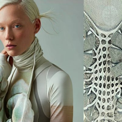
ACTIVE WEAR TRENDS A/W 24/25
LOOKING FOR INSPIRATION FOR YOUR NEXT COLLECTON?
Get this beautiful digital trend forecast for active wear full of incredible color stories, print inspirations, selected functional fabrics and more.
THIS MIGHT ALSO BE INTERESTING FOR YOU:
Material Innovation for Fashion & Sportswear: Future Fabrics Expo Brussels 2026
MATERIAL INNOVATIONS FOR FASHION & SPORTS AT FUTURE FABRICS EXPO BRUSSELS 2026 June 29,...

Fashion Week Trends A/W 25/26 – 10 Key Trends
Fashion Week Trends A/W 25/26 10 Key Trends from Copenhagen, Berlin & Paris April 28, 2025CMMN...
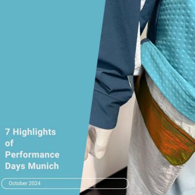
7 Highlights of Functional Fabric Trends Winter 2026
7 HIGHLIGHTS OF FUNCTIONAL FABRIC TRENDS WINTER 2026 PERFORMANCE DAYS Munich Oct. 2024 Oct 31,...

I'm Christine, future driven activewear designer. I offer design and trend consulting for sports & fashion brands, designers or start up`s.
In these areas I can help you:
Trend consulting & Design for activewear: tailored exactly to your brand and demands
Digital trendbooks: inspirational forecasts for your sports collection
Blog Trend reports & Inspiration: Get my trendletter to receive trend updates and studio news appr.2-3 times a month.