FASHION Color TREND S/S 24 by WGSN + COLORO
These colors are supposed to be directional for the next seasons. What COLORO say about the meaning of the colors:
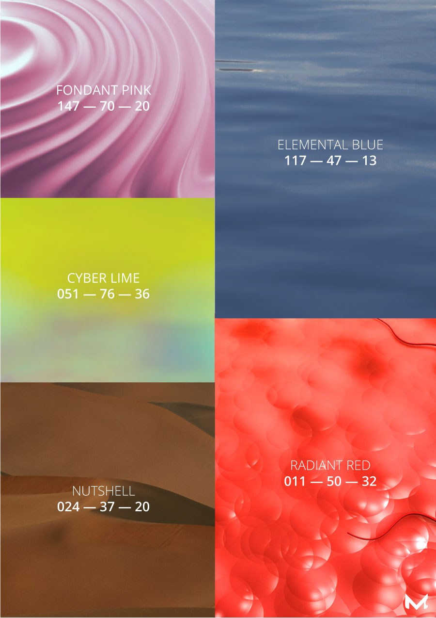
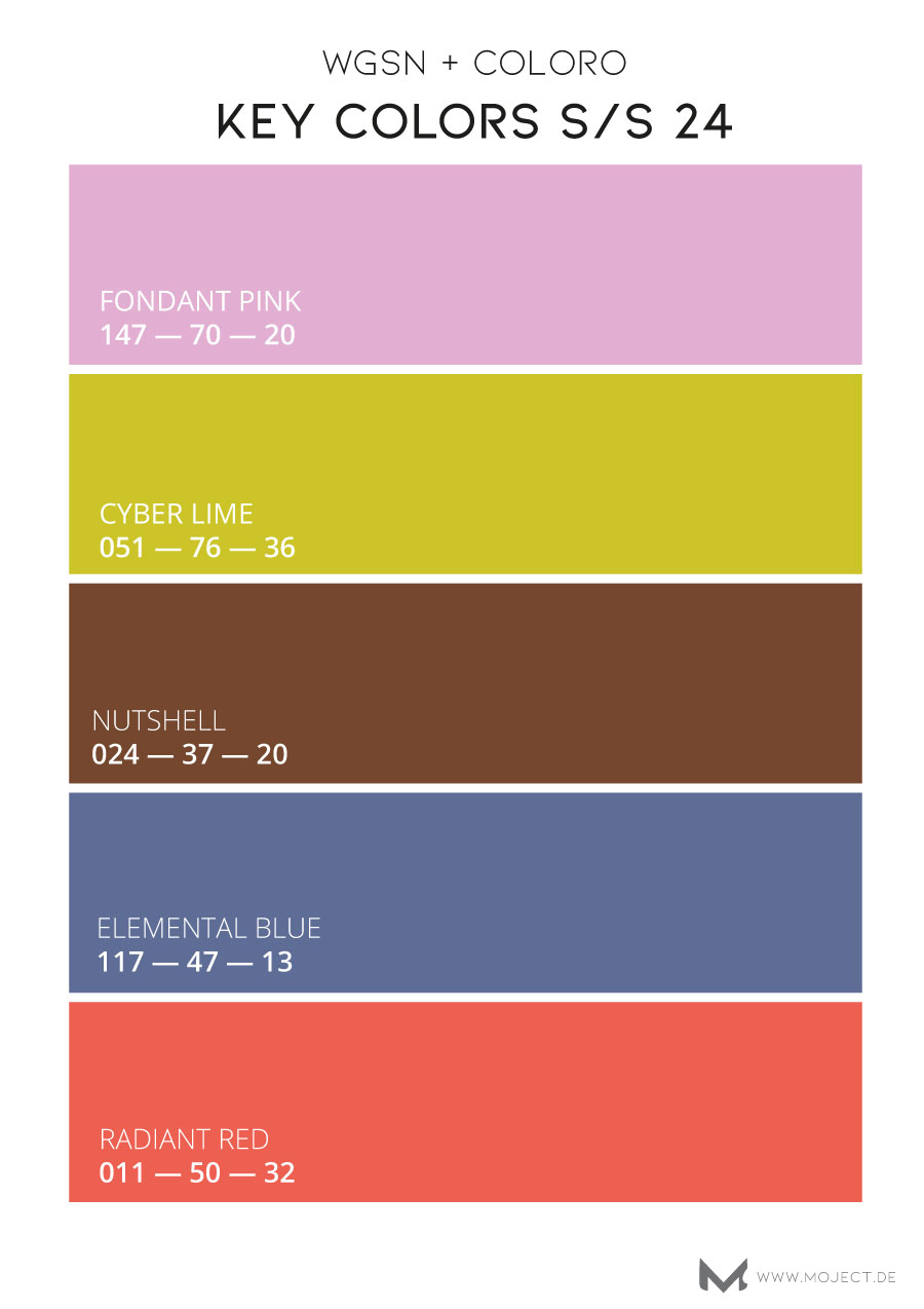
FONDANT PINK 147 – 70 – 20 : „A pigmented pastel with an easygoing, youthful appeal. It signals the return of sweet, mellow shades of pink that blend effortlessly with lilac and lavender shades. This color connects to feelings of delight, a sentiment that will become more important to consumers by 2024. Small moments of awe can act as an antidote to anxiety, enhancing well-being and slowing down our perception of time…For physical products, it will be a directional, gender-inclusive tone for occasionwear, casualwear and kidswear. Paired with a palette of pastels, this color evokes a wellness mood within residential and commercial interiors.“
CYBER LIME 051 — 76 — 36 : „Cyber Lime embodies synthetic realism, connecting us to our ever-expanding digital lives. It is a punchy near neon that exerts and energizes the body and mind. This hyper bright green signifies the powerful connection between nature and technology…t will move into fitness, outdoor, footwear, accessories and kidswear categories, applied as an accent or statement solid color. This vibrant bright is perfect for metaverse beauty, virtual interiors and gaming products. It can also be utilized for home interiors, retail, packaging, tech accessories, e-bikes and scooters.“
NUTSHELL 024 — 37 — 20 : „A rich and spicy brown, Nutshell is a transseasonal color that evokes warmth and reassurance. It’s inspired by the growing thrift and resale culture and consumers determined to rewrite the rules of entrepreneurship and fractional living. This color speaks to sustainability over newness and a growing nostalgic sentiment that sees consumers return to retro-inspired styles and colors… It’s an important color for classic styles and investment pieces, but it can also be used to give directional designs gravitas. Prominent in wellness and hospitality design, it will expand into living spaces, beauty packaging and personal tech products. Due to its chroma, this brown works on a broad range of natural and synthetic materials.“
ELEMENTAL BLUE 117 — 47 — 13 : „Elemental Blue confirms the continuation of refined mid-tone colors that speak of a slowed-down lifestyle and increased sensory awareness. This practical color aligns to the pursuit of seeking the right balance of work, internet and possessions, representing a need for stability and moderation. Restrained and industrial in appearance, this low-key color can become surreal and experiential in a metaverse environment….Elemental Blue suits a minimalist aesthetic and matte finishes, however, shimmer and hyper tactility adds newness. Forecast as an annual color, it is ideal for interior paints, furniture, home tech, transport and mobility design.“
RADIANT RED 011 — 50 — 32 : “ A sweet and playful summer hue with a delectable quality. It confirms the importance of stimulating and emotionally engaging colours that morph effortlessly between physical and digital realms….Radiant Red encapsulates the need to nurture a more affectionate, caring and loving culture.
This red feels light and youthful and yet its optimistic nature relates to all age demographics and genders. Whilst its exuberance shouts high summer, Radiant Red is a transeasonal bright, suitable for a range of fashion categories. Brands can utilise it’s invigorating quality for energising self-care and wellness-led beauty, personal tech, homewares and packaging.“
Read more here.
